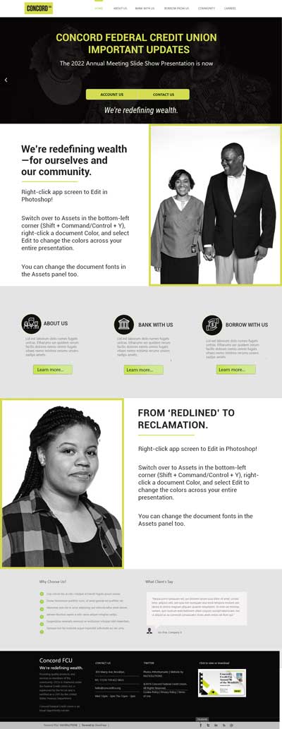
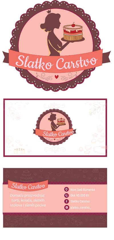
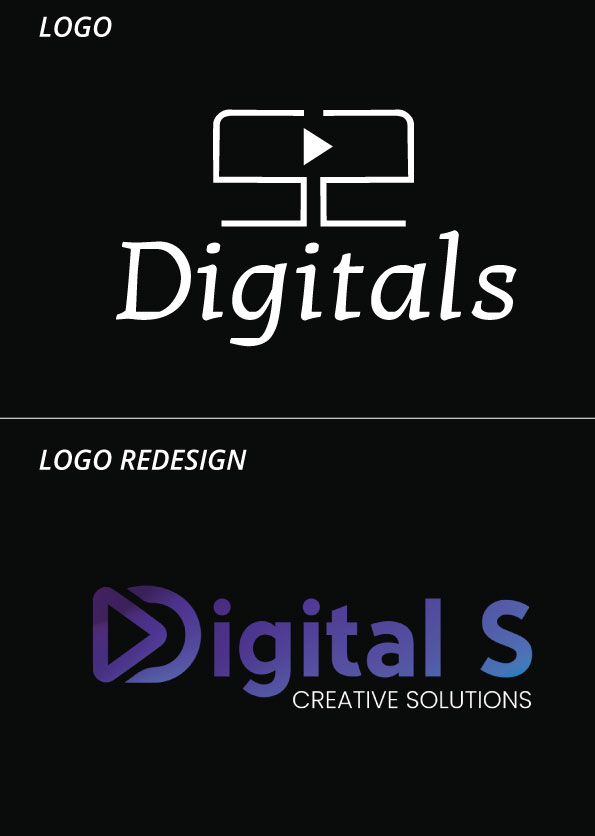
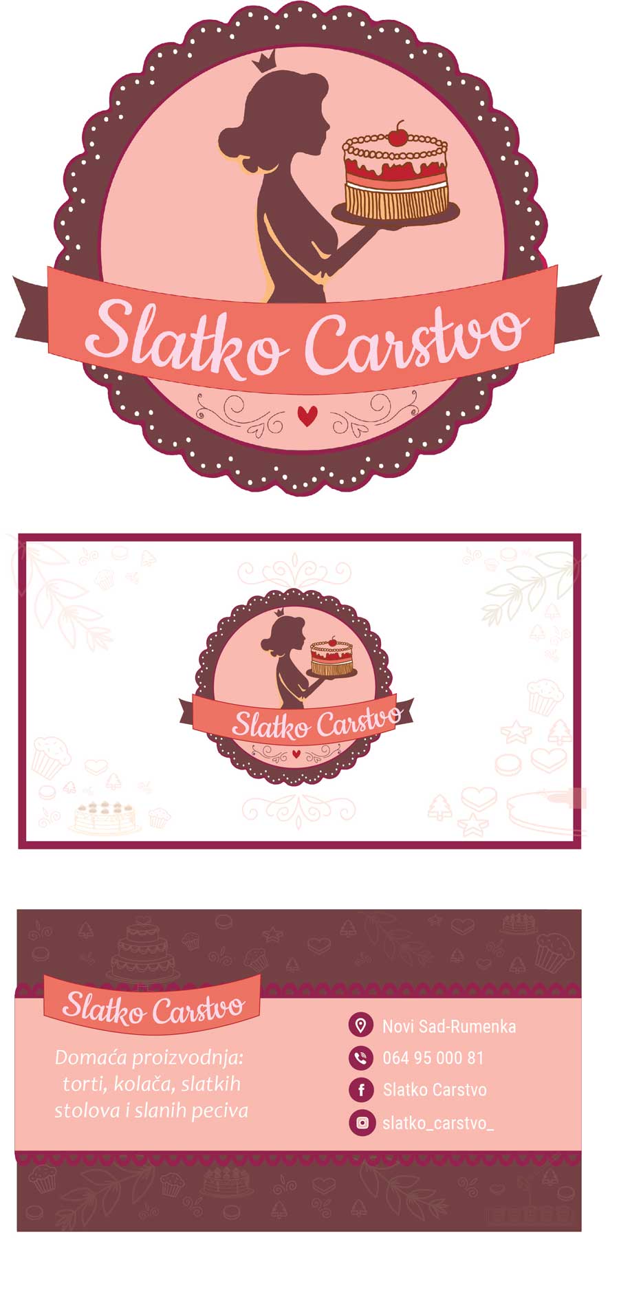
The logo is designed: So that the initials of the owner (double "C") are facing each other, they create a computer screen that is a trademark of the company. I made a business card of the same colors, with information about the company.
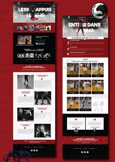
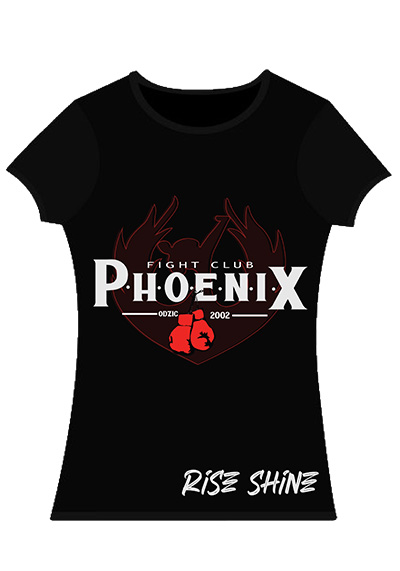
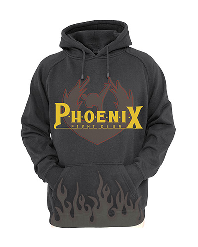
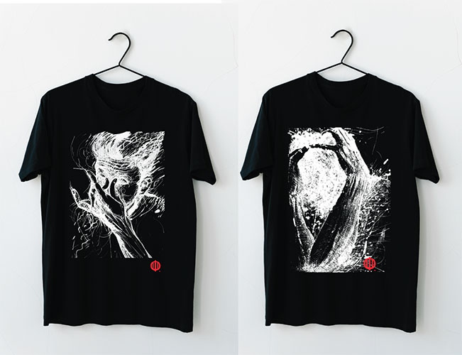
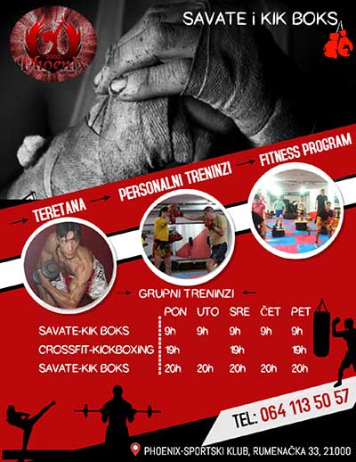
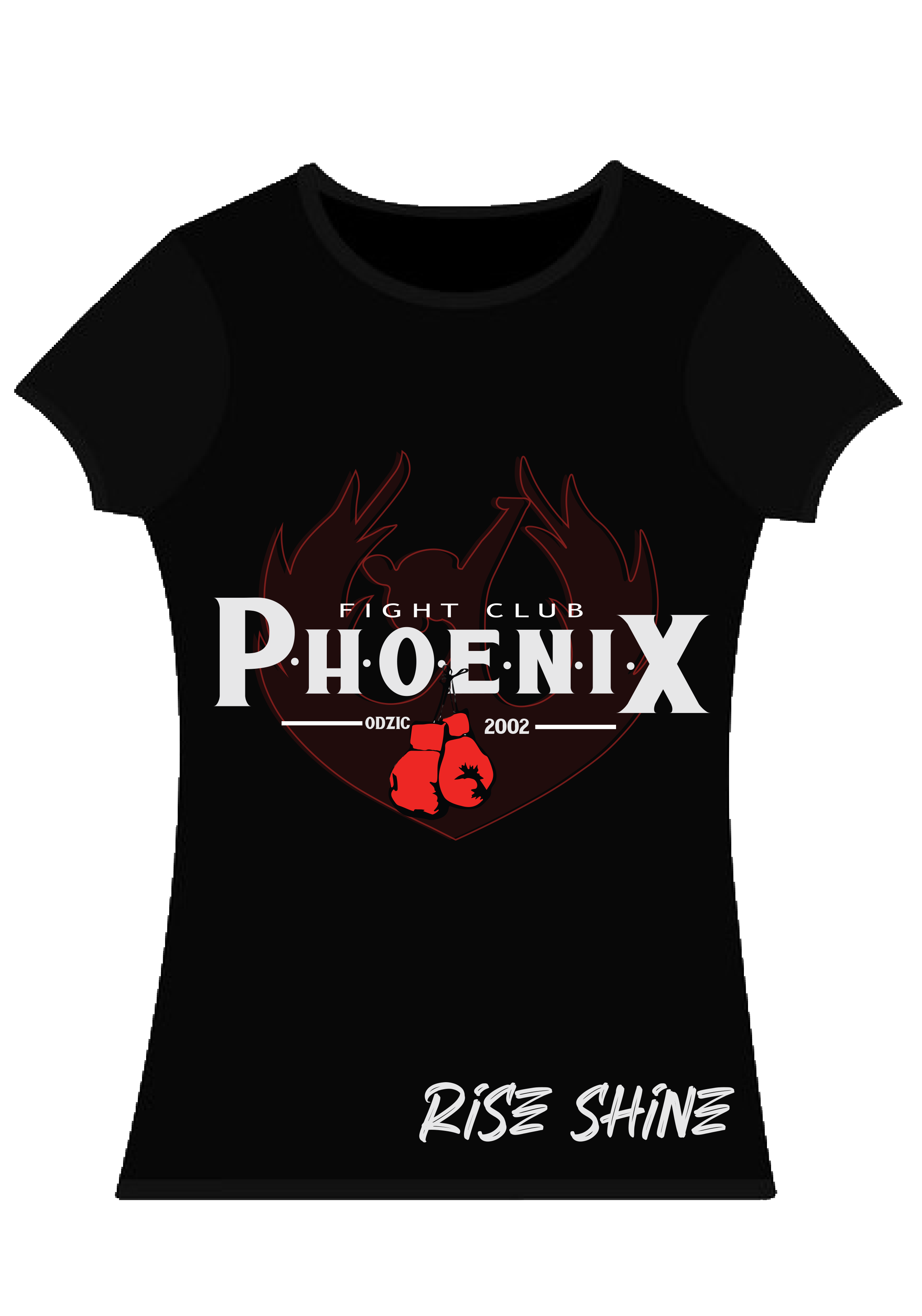
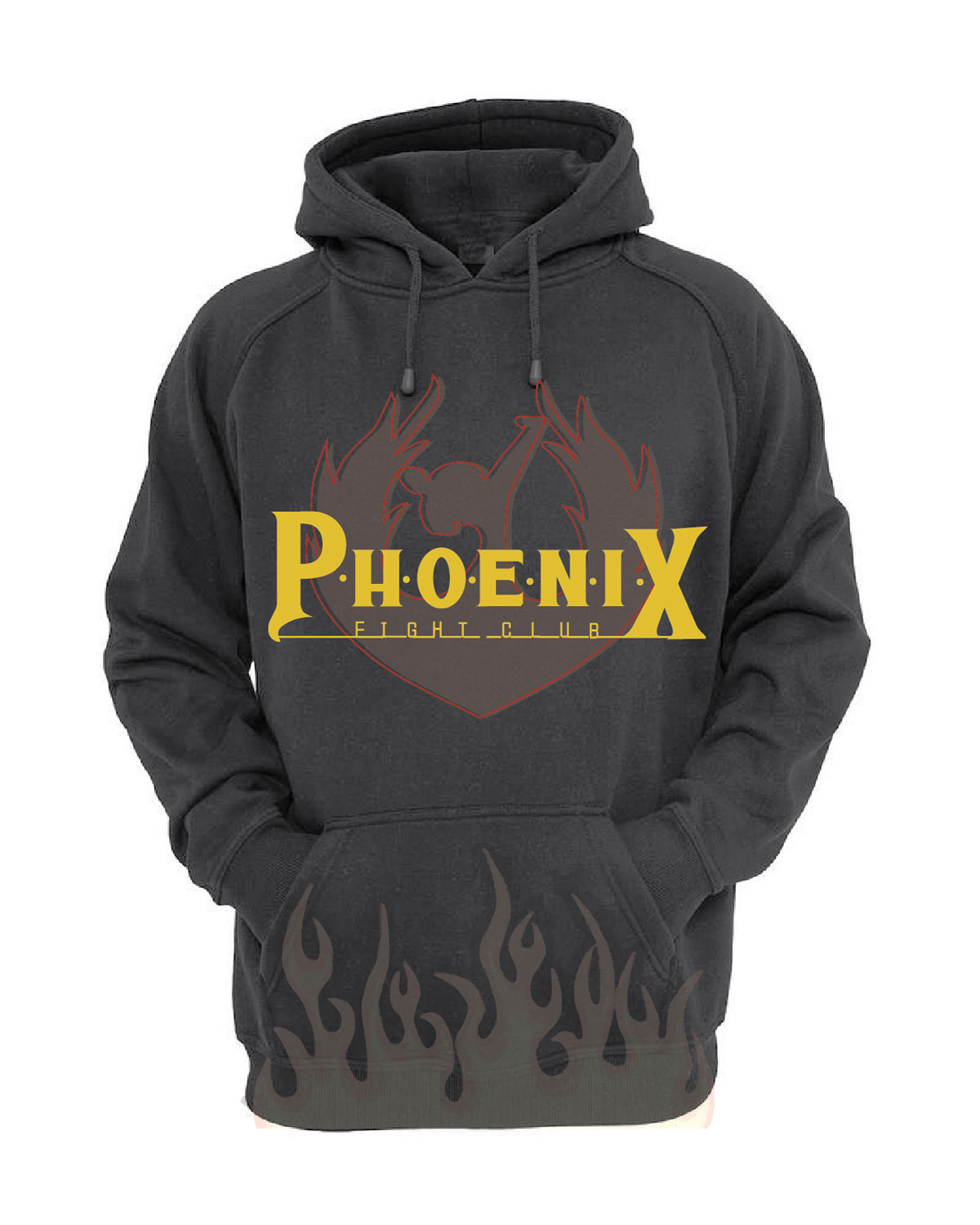
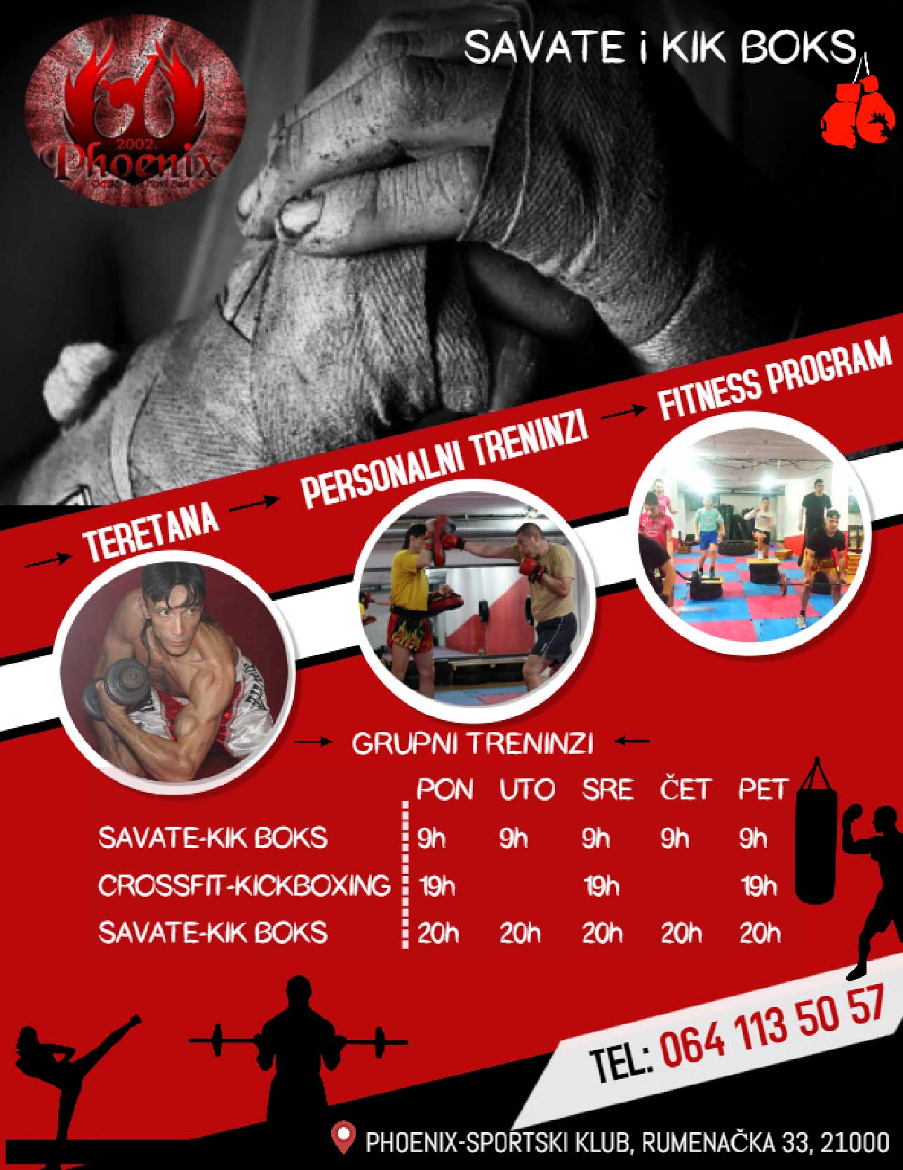
Sweatshirt design for fight club "Phoenix"- trademark redesign, with a few changes such as: font correction, and creation of a new drawing, using colors that match the club's red and yellow.
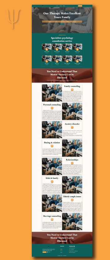
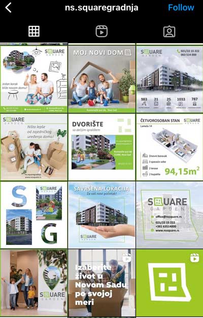
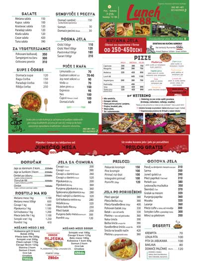
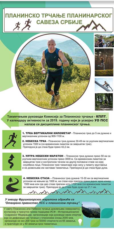
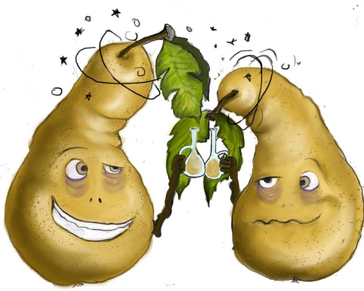
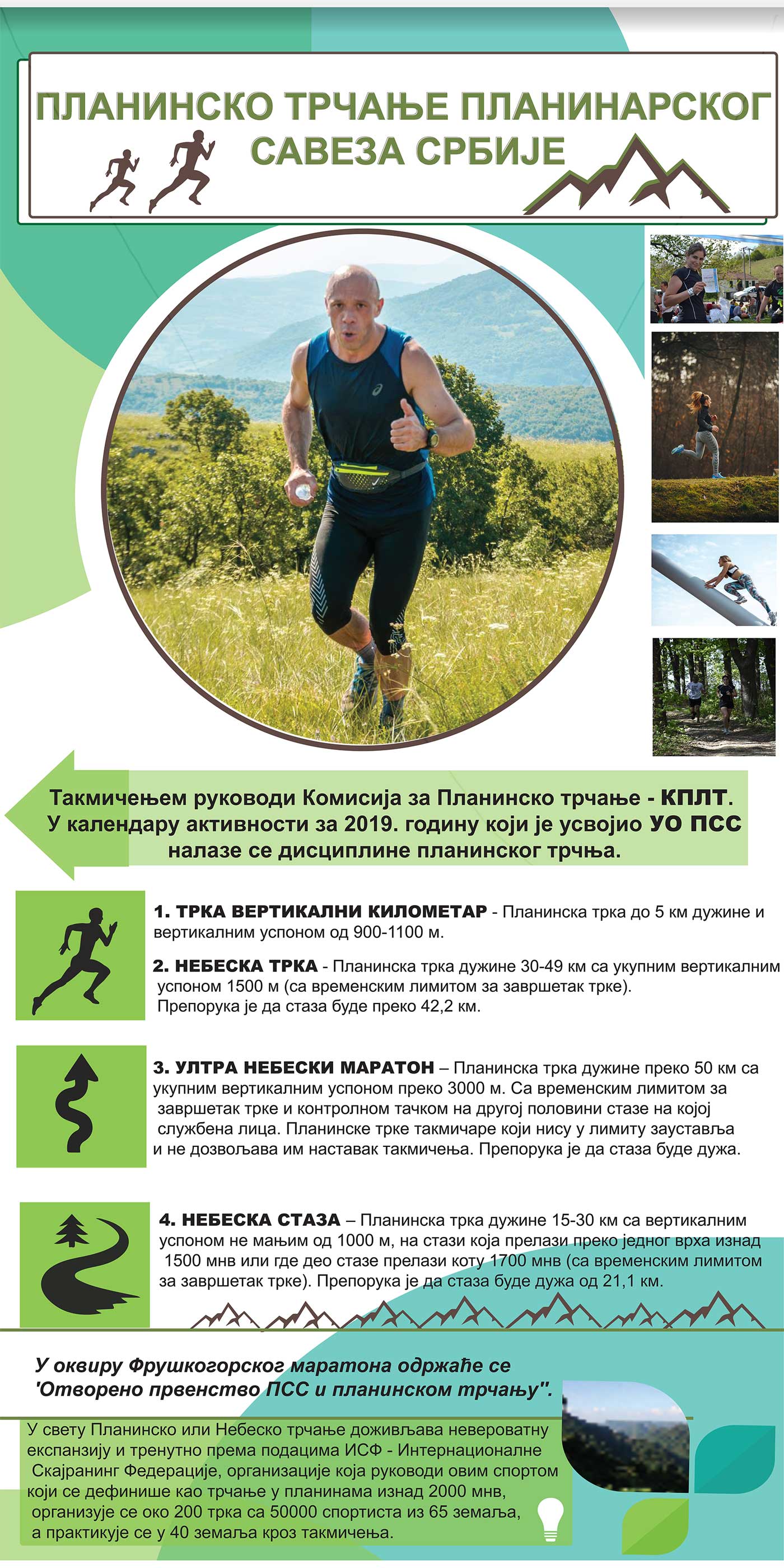
Design for roll up banner for hiking. Creating story from text, illustrations and default photos. With the main purpose of reading information and instructions.
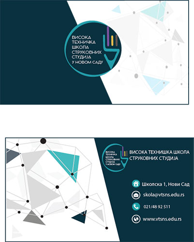
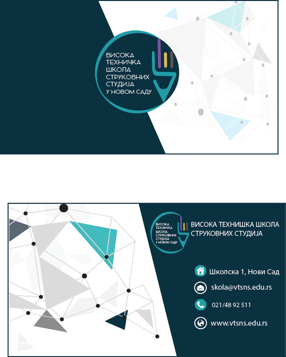
Trademark redesign for „Viskoka tehnička škola-strukovnih studija“. The name is inside a circular form that emerged by writing a pen composed of 4 parts that make up 4 sections of the faculty.
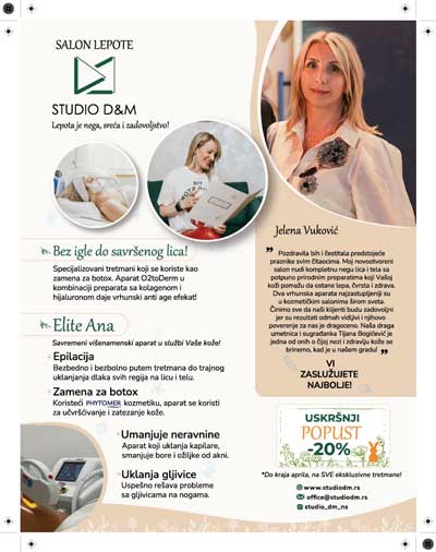
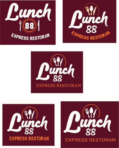
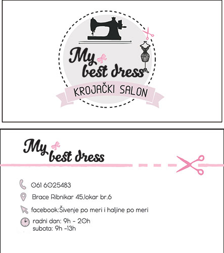
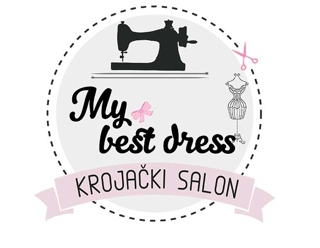
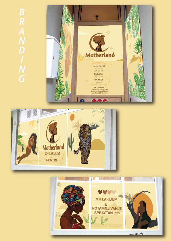
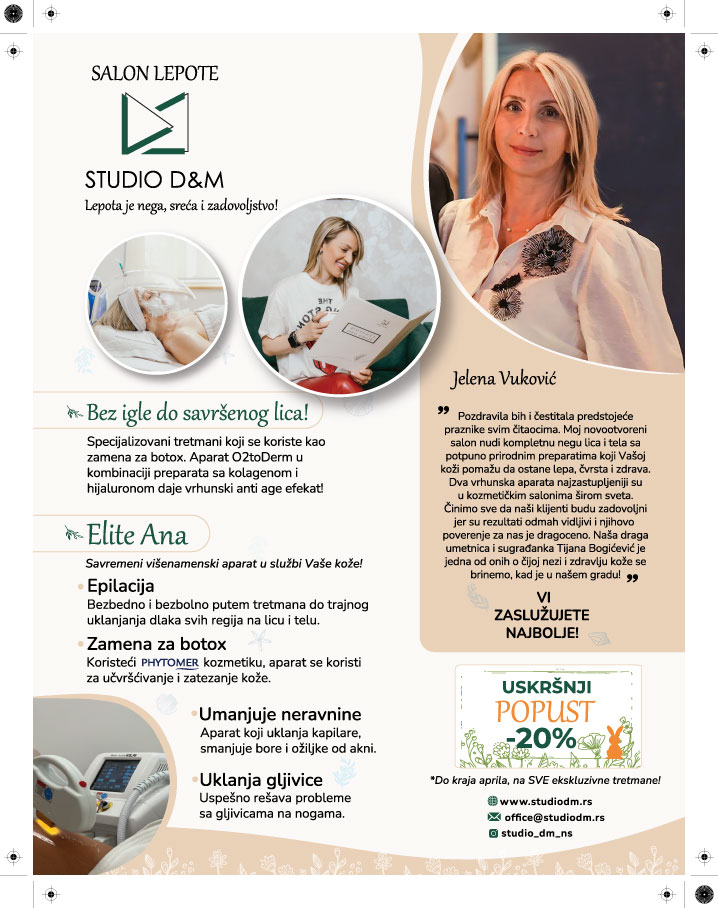
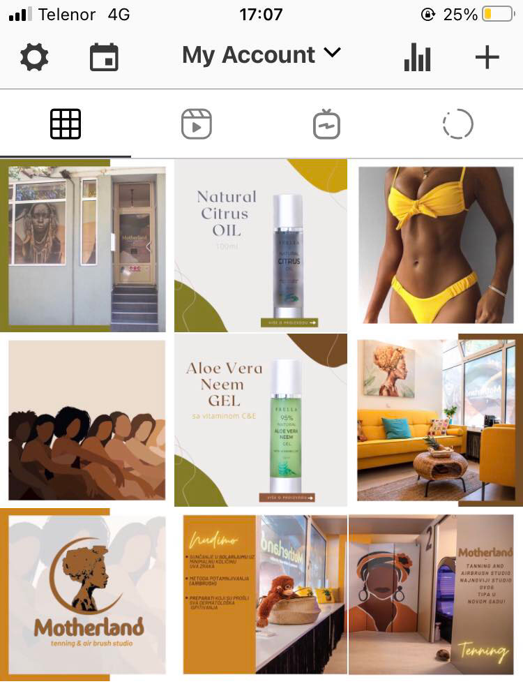
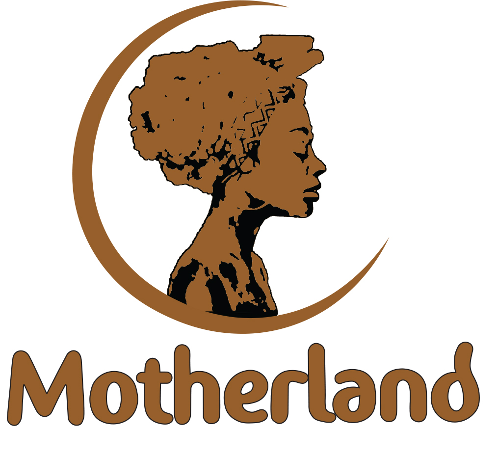
A unique salon trademark, created from an illustration and a font customized for salon's name. It fits perfectly in a circular shape, gives a clear impression of a logo for those purposes.


